Friday, January 14, 2011

How to Sell Ink

Rube Goldberg Outwits the Common Man

Art or error?... you decide.
It's hard not to be a conspiracy theorist if you use Epson® printers. The entire system is rigged to sell ink and the newest technology has it down to a science.

Science of Selling

If you want to sell one thing, you can do that by selling something else that uses it. Cars and gas come to mind. Even the Internet shares this odd form of marketing co-dependence, to fume existentially. Certainly the desktop digital-printing paradigm is a pure form of this theory in action.

It's starts when you buy your machine.

How on earth can you be buying such a machine for such a price?

I don't care if the was made in China or Chile... It doesn't make sense that you can get a color printer for little more than the price of a pair of shoes, eh?

It's when you refill the ink that it all starts to make sense. Somewhere along the line I learned that the street price of a gallon of giclée ink is $16,000. Thus, for companies like Epson® it's all about selling ink.

More Is Less, Or...?

Like dope, the smaller the fix the higher the relative cost. Inks in little 12 ml cartridges costs way more per gallon than the same ink in the big new 750 ml containers. I'm no dope, so I use the largest size I can afford... the closest to wholesale. So does any professional giclée printer... the high-end élite of the Epson® market.

Now, suppose you are the ink-sales manager at Epson...

On the one hand, your customers expect volume discounts.

Thus. if the price is lower at high volume, the only way to generate more ink sales income is buy increasing the amount of ink needed to print.

However, that presents you with a dilemma because your advertising guys have been telling you to reduce the ink-per-page statistics.

What to do?

Rube Goldberg Solution

If you find yourself in a conundrum... if the problem seems overwhelmingly confusing... the best thing you can do is get everyone else confused too. That levels the playing field.

Rube Goldberg knew that, as obviated by his incredible designs featuring unimaginable complexity to accomplish a simple task. If Epson® didn't actually consult with Rube on their ink sales strategy, they got the next best expert.
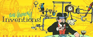
Cartoon of Rube Goldberg 'Auto-Napkin' machine courtesy Wikopedia
http://en.wikipedia.org/wiki/Rube_Goldberg_machine
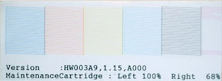
You might ask, 'what leads you to such ideas?' ...And I asked myself the same thing as I was going through yet another nozzle check before using my almost brand-spanking-new Epson® 9900.

The color bars of a nozzle check are a familiar sight to any Epson® printer.
These unbroken lines reveal clear nozzles.

If you follow this blog you have been hearing me harp about the necessity of cleaning the vivid magenta head just about every time I have to print. Although I seem to be the only one with this problem, it is still part of my realty and therefore started leading me to the kind of confused thinking that happens when you are angry.

It's easy to see that the vivid magenta nozzles are clogged.

I don't like anger, do you?

I hate feeling trepidation when approaching anything. You too?

When I walk up to my new printer I want to feel like Superman. He doesn't need to do a nozzle check every morning, so why should I have too? But I digress...
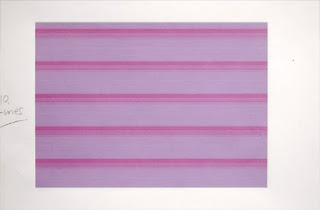
Hoping to blast out the offending nozzles, I printed a 5 X 7-inch block of
solid magenta with this beautiful pattern as a result (see close-up below).

Although this pattern might make a nice businessman's shirt,
for me it means that ink costs 'the shirt off my back'.

Most people imagine a print head to be like a garden hose or a spray paint can. Fair enough. However using that illustration, an Epson® 9900's print head has 90 nozzles. Imagine then an array of 90 spray paint cans arranged in a grid of 9 X 10...And imagine a few are misfiring. That is how one could design striped shirts, eh?

They aren't single lines at all. The pattern is made of 90 'dashes',
each made by a single nozzle. Tell me that is not incredible!
Having already made magenta head cleaning a part of my daily routine, I was singing a happy tune until the machine stopped mid stream and said there wasn't enough ink to clean with. OK... that happened before with a bad result when I tried to back out of the cleaning procedure using one of the two options available (see a recent blog about memory loss).

This time I used the other alternative and backed out successfully, deciding to change the offending ink cartridge. 'X%&#!', I said to myself, the cartridge still has 1% and I want my money's worth.

My reluctance to change the cartridge was lowered when the machine said I could put it back in for printing, after the cleaning cycle. The procedure is to put in a new ink cartridge, do the cleaning cycle, and then replace the partially used one (if you want to) for printing.

In my case, I would have to do that every morning since the machine required a daily vivid-magenta/cyan nozzle-pair cleaning. However, 'they' recommend against swapping cartridges frequently because the valves aren't built for that (read, 'not robust enough').

So the fun was just beginning...

Loaded Deck

The vivid-magenta cartridge was swapped out with a new one, but the machine still balked, saying that the ink levels were still too low.

Matte black was another known offender (and the subject of the first blog about ink anomalies with the Epson® 900 series, written a month or so ago, reporting that the ink-level displays on the machine & computer needed a reality check).

So the matte-black ink cart was swapped out with a new one... but still the machine refused to clean. It demanded yet more ink!

Warning lights on the 9900 ink-level display start to flash at about the 20% mark. Six (of 10) inks were flashing, so which one to do next? The machine offered no help.

I decided to call my dealer, John Harrington. John is like a veteran of foreign wars when it comes to giclée printers. John has his son Ryan in active duty and assigned to the front line. I got him on the phone and reported what was gong on. He told me that I was on my own with Epson® (...but I knew that) and (importantly) nobody else had reported any similar problems with daily nozzle cleaning of any ink.

In the end, every cartridge was swapped out... the cleaning cycle done... and all the old ones put back in.

Do you see where this is going?

We have a policy at Vashon Island Imaging to always have a loaded deck of ink cartridges. Part of that is island mentality. Up in Vancouver, we don't need to because the Epson® dealer is within walking distance. So there we might have one or two carts of the colors that go fastest. That's probably what you do.

But remember, right now you are the ink sales guy... And he just got you to double up on your ink inventory... procedurally.

During all of that Rube Goldberg hocus-pocus, you better believe that more ink is being used too... but not recorded in the ink-per-page statistics.

You've heard the expression 'buyer beware', eh?

Printers Beware

The ink sales manager has passed on the conundrum to we, the printers. It's like passing the Olympic Torch... from town to town until all the profits reach Epson® 's offshore account.

Here's our conundrum... we used to calculate our pricing based on ink-per-page statistics gathered wherever we could find them and then averaged with a 'fine-arts factor' (read, 'more ink than normal').

Nobody can say what an average ink usage is or should be because there are so many different kinds of printing situations. In general, business printing uses a lot less ink than graphics. Our ink coverage is heavy and huge compared to any averages you find out there. As a result, we factor up those averages to account for our heavier ink coverage. But even that wasn't enough because of the 'hidden' costs like the ones you've just read about... Costs in both time and materials.

Now that we have a better idea of our real ink costs, how do those get passed along to the customer? This is not the time to raise prices... at least that's what the pundits say, and they are usually right because they are actually 'players' not just observing commentators.

Passing the Buck


At this point we're just eating the cost difference rather than disturb the sales formula. The net result is that our former practice of discounting virtually every sale an extra 10% to drum up business has stopped entirely.

We still offer monthly specials but they are designed to attract business that involves more billable time and fewer materials costs. Aside from monthly specials, we are sticking to publish pricing and eating the increased materials costs.

For the customer, nothing has changed. Prices and policies are the same. Gone, however, are all the free 'extras' and test prints.

Testing materials have always been charged at 50% of retail, which is slightly lower than our costs, tests being a 'loss leader' at Vashon Island Imaging.

Hidden Agenda?

The gist of this blog is a hoax of course (I hope). There is probably no secret plan and Rube Goldberg is a fictitious character.

Even without any hidden agendas, a reality check tells us that things have changed with the times. As Bob Dylan sings, 'You don't need a weatherman to know which way the wind blows'.

The total costs of using Epson® 's superb technology and giclée printing products have been ratcheted up in hidden ways.

This blog's intention is give issues like a little 'ink'.

You know what they say, every sale costs. Sometimes you have to see a little 'red' before you see any 'green'... just like cars, as noted above.

Red Green says at the end of his PBS television show: 'We're all in this together.' And so it goes in giclée printing.

We are all buying and selling ink to one another, in various forms.

It's all part of what I call the 'Zen of Giclée'.

Friday, January 7, 2011

Repairing Pitted Giclée Surface Coatings

Fast Fix for Warts and Craters Marring Giclée Surfaces

© Douglas Mesney 2011
Giclée surface damage is the pits.
Eventually one of your giclées will get pitted. The surface will get pulled away taking the inks with it and leaving a little pot hole in your print. It might be intentional or accidental.

Varnish is the number one cause for pitting and surface ripping. The problem is that varnish never really dries. If two varnished surfaces come into contact they start to bond together. When you separate them, one side will let go, pulling away the giclée surface. Actually, it's the bond between the ground and the substrate that is letting go.

Grounds are surfaces applied to papers and canvases used for printing giclées. The ground is formulated to accept giclée inks, which are suspensions of pigment in water and glycerin.

Glycerin is a sticky substance that is deliquescent, that is it absorbs water as does salt. The water content of glycerin is a constant 30% as a result of its deliquescent properties. Glycerin never dries because of that water trapped inside by chemical bonding. Instead, glycerin percolates into the ground medium.

Percolation is what happens when you make drip coffee... water percolates through the grounds, dripping into the pot. If you used too little water, it would percolate into the grounds but not all the way through. That is what is happening on the giclée surface.

  • Water evaporates up off the ground
  • Glycerin percolates down into the ground
  • Pigment remains lying on the surface of the ground
Giclée prints are fragile because the color is lying on the surface of the print and can easily be damaged by abrasion or air pollution. Thus they are normally coated. Although the coating seals the giclée, its bond to the surface is as good as the bond between the ground and the substrate (paper or canvas).

As mentioned, varnished surfaces stick together when they come into contact and when you separate them one will pull the surface off the other wherever there was contact. Rubber-tipped clamps, a favorite for hanging prints, also bond with varnish as do some other painted surfaces. For those and other reasons we switched from varnish to liquid laminates last year.

Liquid laminates are plastics that cure instead of drying. They don't stick together but if some bits of flotsam get trapped inside the dried coating, removing them will leave pits that need repair.

In addition there are other circumstances making it desirable to intentionally pit the surface to correct problems considered worse ...Huh?

Intentional Pitting

It may sound crazy but sometimes you need to create one kind of damage to fix another, and this is one of those. For example, you will eventually encounter surface blemishes caused by canvas tufts and/or bits or crap caught in the coating.

Canvas tufts are imperfections in the weave that cause a little lump. The lump becomes more apparent when the giclée is coated.

'Jellyfish' are another problem. They are what I call semi-congealed bits of the coating. Small ones can be hard to see when the coating is wet and milky, but their lumpy profile is easy to see when the coating hardens and clarifies into 'warts'. But by then it is too late.

To fix problems like those I use a scalpel and do surgery. Using the point of a new scalpel blade, I slice around the wart-like protrusion and then pluck it off the surface with fine-pointed tweezers. The result is a pot hole in the print.

© Douglas Mesney 2011
Photo-micrograph extreme close up shows 'pot hole' in glossy, laminated-canvas print surface.
Plucking off surface 'warts' leaves craters where the ground pulls away from the substrate.


Color & Fill Pot Holes

The substrate at the bottom of thee hole is paper (even if it is 'canvas'). The paper must be colored to match the surrounding tones... a process photographers call 'spotting'.

© Douglas Mesney 2011
Use watercolors to retouch the paper surface exposed at the bottom of the pit.
Give the color a texture to match the look of the areas around it, outside the crater.
Note that this crater's color looks too dark because it is not glossy
and doesn't reflect the light like the shiny laminate all around the hole.

Spotting
involves using a very fine tipped brush with water-color dyes to stipple flecks of color into the spot of white paper at the bottom of the hole. You'll be tempted to use a blob to do the job... don't. Build the tones up gradually, with the tiniest dots you can stipple, until they match those around them.

After spotting in the color, use a hair dryer to get the watercolor dyes thoroughly dry. Then fill the hole with a drop of the liquid laminate fluid (or varnish if you are repairing a previously varnished canvas).

Two, three or maybe even four drops will eventually be used to fill the hole. Let each drop cure entirely before adding another (at least one hour).

© Douglas Mesney c/o Michael Elenko 2011
Use a toothpick to accurately place a small drop of laminate fluid in the hole.

© Douglas Mesney 2011
The right amount of laminate will bulge out of the hole.
When it cures the drop will sink into the hole leaving a smaller crater.
Depending on the size of the crater, you will need to get back in there two or three times more to build up the 'caldera' in the crater until the surface looks like a well repaired pot hole in the road.

© Douglas Mesney 2011
Arrow points to light reflecting off rim of crater filled twice before.
Here a third, small droplet of laminate fluid has been placed in the slowly filling hole.


© Douglas Mesney c/o Michael Elenko 2011
Use a hair dryer to speed up curing and work the hardening laminate
in the hole with the tip of a toothpick to texturally match the surrounding surface.


Finish the repair with a new top coat of laminate across the entire surface. After that you may still be able to see the blemish. But unless you say nothing, nobody else will.

(Shhhhh!)


Anomalogical Observation No.2 - Short Memory

Canceling Job Via 9900 May Cause Loss of Prefs

You know how annoying it is to lose your printing preferences, right. That very thing happened to me this evening, after canceling a printing job via the Epson® 9900 control panel instead of by the computer. When I went to reprint, all saved setting had vanished.

At first I couldn't believe it... I thought I was losing my mind and had done something wrong. Then I discovered that it was the machine that had lost its mind, not me.

Why I canceled the job is a story in itself.

I have gotten used to doing nozzle checks, which regularly reveal that if the printer sits idle for longer than 36 hours, the vivid magenta will clog, requiring cleaning. And, sure enough, after slightly less than that, the 9900 was telling me it wanted yet another cleaning for vivid magenta and this time also black.

Recall that an earlier blog, Anomalogical Observation No. 1, concerned an inaccurate ink-level display for black... the display warned that the level was 1%. That blog was written a month ago, or so it seems, and the machine still hasn't run out of black (although it really should about now). So black has been a suspect for a long time, and now the machine was telling me to clean that print-head pair. Fair enough, I reckoned and began the procedure. [Early blogs are at http://gicleeprepress.blogspot.com]

Flashing bold red type on the 9900 display panel warned that there was insufficient ink for a cleaning. The machine suggested continuing by replacing the ink cartridge... but which one? Five of the inks have been flashing low level warnings for a l-o-n-g time. It's really gotten to be a 'cry wolf' kind of thing and I stopped paying attention to the light show on the control panel (which looks especially impressive if you turn off all the room lights).

The machine provided nary a clue about what to do next. So I decided I didn't want to play.

Using the 9900 control panel, the is an option to cancel the job... so I pressed OK to that option... and when I went to reprint, that's when I discovered that all the saved printing preferences had disappeared. '#%@&%', I swore in Swedish.

If it were 'just' a few prefs I wouldn't be fuming. But at Vashon Island Imaging we work with a lot of artists and use a lot of different stocks as a result. Now all those profiles need to be set up again. So much for closing up 'early' tonight.


Thursday, January 6, 2011

Fast Fix Ups for Faded Snapshots

Classy Restorations at Yesteryear's Prices

Before and after of class picture restoration.
Family-album restoration is our January special at Vashon Island Imaging. We're offering a scan, touch-up and a 5 X 7 giclée print on heavy-weight art paper (Epson® Enhanced Matte) for $15.00.

Hmmmmm... $15.00. That's about what I used to charge way back in 1972 for an 8X10 printed on Kodabromide® paper... double weight Kodabromide.

Even if 1972 is ancient history for you, any printer knows that's an incredible bargain. However, if you are a customer, that low price makes restoring fading family snapshots affordable. Any higher price risks putting an 'extravagance' like photo-album maintenance out of most families reach these days.

Affordability is the key word in our new economy. It's more than a word, being also a concept whose time has returned. 'Mature' printers like me have been in this situation before. I've been there three times in my life when the economy goes through one of these 'cycles'.

But I digress... and you can read my opinion about all that in an earlier blog. (The Creature from Jekyll Island... at http://gicléeprepress.blogspot.com or www.mesney.com .)

To be able to offer such a low price we've got to work efficiently. Fortunately, most faded color prints share the same problems and can be fixed up fast using the following procedures:

Underexpose the Copy

Faded photos show problems worst in the highlights, the light tones. The whole picture is usually bleached looking. However, fading in the dark tones can actually work in your favor as the lightened shadows reveal more details.

The essence of the problem is that the light tones have little differentiation any more. They must be treated as 'latent images'.

Technically speaking for a moment... Latent images are imprints of light captured by film. The light begins a chemical process in the emulsion, which is later developed. The chemicals used to develop the latent image continue the chemical reaction started by the light... the breakdown of silver halides into particles of metallic silver, called 'grain'. It is those grainy metallic-silver particles in film and photo paper that form the visible image.

[In color film, halides of other metals are used and they are replaced with chemical dyes during development. No matter the process, it all begins with a latent image.]

Compression Reversed = Expansion

The development of latent images involves expansion of tone differentials. That's a fancy way of saying you've got to build up the contrast and doing that requires density. The original density has faded away, and now has to be restored. Underexposure accomplishes that in an instant.

Underexposure results in a miserable looking reproduction,
which is ideal for generating contrast.
This is actually 1.3 stops below the ideal exposure.

[Note that the bottom edge is a gray-card with ruled increments.]
Normally I make three exposures, one normal and two darker. For the initial exposure I find the point at which white falls off the histogram and back off 1/3 stop. The two subsequent exposures are bracketed a further two thirds of a stop. Nine times out of ten I will end up working with the darkest of the three. That's what I did with this one...

Auto Levels Finds New 'Poles'

90% of the time, Auto Levels does 90% of the work.
Copy the dark original and use Auto Levels to re-set the picture. Before you do that, crop out the white borders and anything else that's white or black... unless of course it is part of the picture's subject.

The objective is to have Auto Levels create new black and white points, which are the twin poles of a new histogram. Auto Levels will also do some color correction, too.

Auto Levels will set the white point too high for giclée printing however. Remember, 'auto' anything is geared for the mid tones. Darks and lights suffer as a result. But there is a quick fix for that...

Lower Highlight Brightness to Add Details

Adjust the Auto Levels layer further by using Brightness & Contrast to add ink to the highlights. ...Huh?

Adding ink to light tones seems counterintuitive but in this case we do really want them to be darker... not much, just enough to add a little ink... 3-5 points on the CMYK Info Panel is the minimum... or 250 on the RGB scale.

The purpose of the density is to reduce paper glare in the white areas, and build up density in the nearest light tones to obtain visible differentiation.

Density can be further enhanced quickly by burning the highlights with a very light touch (lower the brush opacity).

Importantly, every printing press is different. Where a three-point density adjustment is visible on the Epson® 9900 10-color printer we use at Vashon Island Imaging, you may need more... or less.

Dial your system until you just a tad of density in the whites. The border of the paper or canvas should be the only part devoid of any ink.

At this point there is a 'Leveled' layer atop
the dark original picture layer.
Separate Skin Tones

Make a layer that has the color adjusted for the skin tones. For a starting point try this using Image | Adjust | Color Balance

  • Shadows add 22 points of red and yellow
  • Mid tones add 22 points of red
  • Highlights add 11 points of yellow
The adjustment depends on your version of skin color, of course.
The point is that yellow and red must be added to the skin...
...not blue or green.


Separate and 'Colorize' the FG and BG

Colorization is a term I coined to describe the hyped-up colors that I like so well.
Sending the color in a particular direction using color adjustments like those above,
then saturating it to some degree does it all. Another way is to saturate first and then
tame that with color adjustments.

Quite often the foreground (FG) needs a completely different color enhancement than the background (BG). Above, the FG grass needed a big kick of yellow in the dark tones, green in the mid-tones and a kiss of blue in the highlights. The BG roof layer needed heavy red in the shadows with red and yellow in the mid tones and a kiss of yellow in the highlight regions.

The colorized layers were blended with the warm (skin) tones layer using gradient masks. (Previous blogs and my book detail those masking procedures.)

Erase Through Warm Layer to Reveal Cold Tone Layer

In this scene, most of the people were wearing
brown suits so only a little erasure was needed
to get a realistic looking effect.
Erase through the warm (skin) tone layer to reveal anything that needs to be white, letting the cold tones (Auto Levels) layer show through in those parts.

Adjust the opacity of the warm tone layer to get a good balance with the cold tones layer.

Group Merge & Saturate

Five-layer stack before merging.
After merging the results so far, give it a final saturation adjustment. Over saturate slightly because the next step is sharpening, which reduces saturation by adding white and black.

Merged layer saturated by 22 points.
Sharpen & Blend

Copy the saturated image onto a new layer and sharpen it. For this 4000 X 2600 pixel image the setting for Unsharp Mask was 2.2 / 222.

Sharpened saturated layer blended 77%
with dark original to dirty the colors slightly.
De-saturating produces a similar effect but not the same.

Blending with the underexposed original produces 'dynamic dirtiness'.
De-saturation attenuates all tones equally.

The sharpened layer is placed uppermost in the stack of layers and its opacity is usually slightly reduced to avoid the crisp electronic look of a heavily sharpened image. The amount of adjustment depends on the image. As you already know from previous blogs, some pictures actually benefit from hard sharpening.

Life In the Fast Lane

Do you watch auto racing? Well, these procedures are like the giclée version of a pit stop... in and out fast. The above transformation was done in 12 minutes and produced a pleasing 8 X 10 giclée as a result. It took twelve times longer to write and illustrate this blog about it than it took to do the restoration work.

The procedures seem complex at first but there's really nothing to it. After a dozen or two you'll hum along at lightning speed.

By being able to process 5 such pictures per hour, our studio is able to generate reasonable hourly earnings while our customers benefit from reasonable prices that are affordable in today's unreasonable economy.

At least that's my reasoning.

Monday, January 3, 2011

Get A Grip on Black

How to Handle Dark Tones

© Douglas Mesney 2011
Like an 8-ball, black is something you want to be 'behind'.
Up front, black seems simple enough. There's even a song right...'Black is Black'? However, any printer can tell you that there's nothing simple about black.

Black is the most elusive of tones.

What Is Black?

Black is defined by what is around it, as are all tones.

The white spot in the 8-ball above isn't white at all... it's a shade of gray that looks white against black.

© Douglas Mesney 2011
The old gray-box illusion says it all. Each of the two inner boxes are the same color -- 50% gray... but they don't look the same, do they? (If you answered 'yes', you need read no further.)

Black is like people's behavior, part environment and part heredity. No matter the sources, you have to deal with what you've got. That is especially true in printing.

It's easy to identify a picture that has been printed with too much or too little black. But what is enough?

Dynamic Tone Range

Black is one of the two 'poles' of a histogram, white being the other. All other tones fall between those two absolutes. The range of tones between black and white is what I refer to as the Dynamic Tone Range. The word 'dynamic' is included in the term because a change to one tone has an effect on how all the others are perceived.

The number of tones in the range determines the look of the image. A representation of reality made with three colors cannot look the same as one made with thousands of different tones.

As tones are added, the dynamic tone rage widens... all the while anchored on black and white. That is why the black point and white point of a picture are so critical... and so problematic.

The problem begins with image capture and extends all the way through every step in the printing process. And what is the problem? Averaging.

Average Results

Virtually all image-processing algorithms are aimed at mid tones. Colors beyond their range are rounded up and averaged during processing. Only expensive capture devices capture details in the extremely dark and light regions of an image.

People use 'HDR' (High Dynamic Range) shooting techniques to extend the dynamic tone range. HDR is digital bracketing.

'Bracketing' is something photographers have been doing since George Eastman was in diapers. It's a fancy name for multiple exposures. You make a dark one, a light one, and middle one then mix together the best parts of each.

Now of course they make it seem that you need their latest gadget or software to do HDR... that's marketing. Read my book (and this blog) to find out how to do it the good old-fashioned way, without the expensive smoke and mirrors. But I digress...

Black and white is critical to the look of a picture, yet those two tones and those around them are the most problematic for printers.

Pictures are made on computers these days and people make them looking at monitors of all sorts. When a picture looks right on a monitor, it will make an OK print, but not a great one, as you already know, (maybe from reading this blog or my book).

Black and white on a monitor is not the same as black and white in printing. Not even by a stretch. So the files people give you to print will normally have problems in the dark and light tones, unless made by someone experienced in such matters of prepress, which is rarely the case.

Seeing In the Dark

© Douglas Mesney 2011
Be a wise old owl, keep reading this blog.
The mark of a great print is its luminosity.

'Luminosity' is being able to see details in the dark and light regions of the print. The quality of luminosity is the result of a very wide dynamic tone range.

Before very recently only real photographic prints had luminosity... and those fabulously expensive art lithographs and gravure prints. The reason? Those printing processes produced more tones than most other printing process... until now.

The very latest 10-color Epson® giclée printers produce the widest dynamic tone range of any printing process. That makes luminosity possible, but doesn't produce it automatically. Luminosity is something you add, by extending the dynamic tone range... a job called prepress.

'Prepress' is a term used to describe the adjustments to a picture file necessary to get the best results from a specific output device. Most of the work involves adjustments to the tone range. The prepress artist works up the tones in the dark and light regions, so that details can be seen better in these formerly 'hidden' regions.

How can you do prepress work on tones that you can't see on your monitor? Good question.

Fly by Wire

When you take a qualifying flight for an 'IFR' pilot's license (Instrument Flight Rating), the windows of the cockpit are covered. The pilot has to take off, fly and land the plane blind. Fortunately, you do not need to cover your monitor to control printing color.

Use the Eye-dropper sampling tool in combination with the Info Panel and the Color Picker to dial in your colors by number. At first it will seem awkward, but imagine how those pilots feel.

As you are sampling and reading the Info Panel, remember that in no case do you want 100% of anything or 0% (Zero) of anything.

That means stay away from Zero (black) and 255 (white) in the RGB section of the Info Panel.

In the CMYK section of the Info Panel, black limit numbers are:

  • C 75%
  • M 68%
  • Y 67%
  • K 90%

Notice in the Info Panel's CMYK numbers that 90% is the ink limit for black (K). Why? So dark tones don't clog up. (The white limit is Zero... no ink... the paper is the white tone.)

Strange looking numbers, eh? I told you blacks are weird.

Blacks Are Not Created Equal

Using all the colors on a four-color press makes 'rich black'. Black inks alone produce a wimpy dark gray tone, not black.

The numbers displayed in the Info Panel are arbitrary and simulate the ink blend for rich black on an average theoretical four-color press... of which none exists in actuality.

However, giclée-printing machines achieve black in a totally different way, as does your monitor. Nonetheless, the numbers are useful for identifying specific colors and when your shadow details are sinking into obscurity.

Every Color Has a Number

The millions of colors that your equipment can display and print each have a number, which is part of the information given in Color Picker. There you will also see the components of the color expressed as mixtures of both RGB and CMYK (LAB and CIE are spaces not usually used by print artists).

The significant thing about that color-numbering system is the control it offers. It means that you can address any of the millions of colors individually... you can change colors a millionth of a percent at a time. With that amount of control, there's no excuse for clogged up dark tones and burned out highlights.

Controlling Blacks

There are two types of control... technical and creative.

The artist who made the picture did the creative part, now it's your job as a printer to reproduce the artist's intentions as best you can. Of course, if you are the artist the following also applies...

Use the EyeDropper and Color Picker in combination with Info Panel readings to check what areas of the picture have slipped into the black void. If they are supposed to be black, that's one thing. However, if there are dark tones turning black in your prints, and you are losing shadow detail, you need to ease off the black ink levels in that region and develop 'highlights' in the dark (think night vision). How?

The answer(s) to that question are the subject of my book and of many blogs. However, to see what details are lurking in the shadow copy your picture onto another layer and then adjust the Brightness & Contrast to open up the darks and see inside.

If there are details in the shadows and you don't know how to get them in your prints, you need a copy of my book and/or a more thorough read through the contents in this blog.

This article will help you identify the black (and white) limits in the pictures you are printing, in terms of ink color instead of monitor color. The first step to getting out of the dark is identifying the problem. You can't see the light without it.

© Douglas Mesney 2004

If you're a new reader, this blog was recently renamed. The first 70 articles are at http://gicleeprepress.blogspot.com and also at www.mesney.com.

Sunday, January 2, 2011

Tip Sheet #8 - Save Big Files Fast

Saving big files in PhotoShop® can take time, even if you have a fast computer. Usually I don't mind... its 'mandatory' time off for daydreaming, the Zen of giclée. As my own illustrations are mastered between 20,000 and 30,000 pixels on the long dimension, I spend a lot of time day dreaming. But other times long saves can be annoying.

Frequently I am saving in the PhotoShop® Large Document Format (.psb) when the file size exceeds 2 gigabytes. But it that takes time too, especially when you save to multiple locations, which is our policy, for safety's sake, at Vashon Island Imaging.

Cutting Down Save Time

Most pictures are built in stages... you work on a background, add some foreground, etc.... saving as you go. Saving a big file can take several minutes for each save. Time is money, eh?

A big chunk of the save time is the generation of a full resolution composite, which is a fully bit-mapped version of the picture you are saving. Scaled down versions of the master composite image become the smaller thumbnails used for previews, etc.

If you don't need to see any of those -- and for those intermediate stages of image production and 'just for safety' work-flow saves you usually don't -- you can save the compositing time by turning the picture off before saving it... Huh?

Full Resolution Composite... of Nothing

PhotoShop® pictures are built in layers... each layer has a part of the picture. A composite is all those layers merged together. When you merge layers or flatten an image, you are making a composite. When PhotoShop® saves an image it makes a composite of it first, as part of the saving process. When images are very large, making a composite takes most of the saving time. If only there were a way to bypass that, eh? There is...

You've heard of a 'work around'? ...Here's a 'save around':

Before saving turn off all picture layers and turn on one transparent layer. There should be nothing in the picture area when you save.

Since you can't see the picture, and either can PhotoShop®. Since there's nothing there, a full resolution composite takes no time at all.

Eventually, you will want to be able to see previews of your saved pictures. Save those with the picture layers turned on again.

Saturday, January 1, 2011

Welcome to Giclée Bible

Giclée Prepress Becomes Giclée Bible

© Douglas Mesney2011
We're restarting the clock for our favorite book and blog, giving both a new name: Giclée Bible - The Art of Printing

Why? We'll come to that but first...

We'd like to wish printing aficionados everywhere a very Happy New Year with all the best in 2011.

Here at Vashon Island Imaging our New Year's resolutions are the same as last year's... 240 dpi for giclée printing and 300 dpi for laser.

Now, as to the 'why and wherefore' behind the new name...

Anyone who follows this blog has heard me whine over and over about my identity crisis. Well, not mine... the book's... but it might as well be me.

© Douglas Mesney2010
Nobody knows what the book's title means.
It's a subtle technique that I learned in Sweden
where everyone tries to be
förnuftig (clever).
I've written a blog about the identity crisis suffered by my book and blog, because of their ill-conceived name. [The blog is at the old blog or www.mesney.com]

In that blog I explained how people think that a giclée is an exotic French omelet, a sort of soufflé... And how anyone under 50 is unfamiliar with the word 'prepress' or what it means.

'Prepress' could be a form of squeezing, as far as young professionals are concerned. I could have as well named my book Soufflé Squeezing, eh? That's my theory.

I knew there was a problem ever since the book launched last May, but couldn't come up with a new name until just recently when suddenly it hit me...

Giclée Bible - The Art of Printing


The new name is so simple and so logical that now I wonder about my own two wits that it took so long to come up with. Then again, good things take time, eh?

I tested the new name on a few friends and colleagues first, then on a few random 'strangers'. Everyone who heard the new name immediately said without any detectable hesitation whatsoever they 'got it'. Compare that with a big Zero (out of ten) when I was surveying people about the word 'giclée' and the term 'prepress' at the supermarket last summer, trying to identify the source of the branding problem.

The new name accurately describes what the book and blog are all about... They cover much more ground than 'just' prepress. The entire process of making giclée art is their turf... a place I call 'The Zen of Gicée'.

In the book, the giclée work-flow is divided into 13 steps from concept to finished art hanging on the wall. Everything about giclée printing and finishing is in there so it really is a 'Bible'.

The prepress 'commandments' in my Giclée Bible apply to all forms of printing, because every printing machine and process has the same problems printing your pictures. But you already know that if you have followed this blog.

So out with the old, in with the new.

Stay tuned for the next exciting chapters in the life and times of this island-bound giclée printer. It's the true grit of printing...Like the script for a 'reality' show with 'Survivor' twists. Or maybe So You Think You Can Print. Whatever...

On with the show!